
There is a recurring intuition in modern visual culture of an opposition between two kinds of forms: on one side, environments and styles associated with control, reduction, and structure; on the other, nature, perceived as irregular, colorful, and spontaneous.
From this contrast emerges an implicit idea: control would be a form of distance from life, while nature would embody unrestrained expression.
This article proposes to shift this opposition. It advances the hypothesis that aesthetics cannot be reduced to a choice between order and chaos, but instead arises from different regimes of order natural, perceptual, and social.

From this perspective, control, nature, and power are not opposites, but distinct logics for producing and interpreting form. The question is not what is more “alive,” but how each system organizes the visible, and how this structures our perception and judgments.

OUR SPONSOR OF THE DAY : NEONNIGHT.FR
1. What the visual language of control actually signals
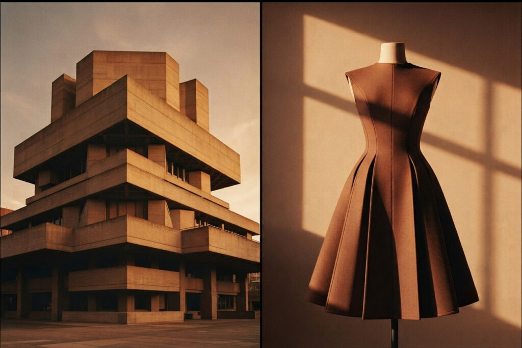
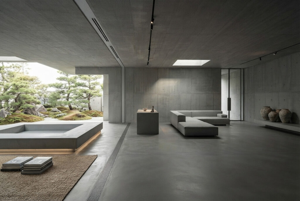
Minimalist fashion, modernist architecture, and brutalist design share a common visual grammar: reduction, geometry, repetition, restraint. Black, white, grey. Straight lines. Clean surfaces. Defined edges.
This language communicates something real, but not necessarily what it is usually taken to mean. At a surface level it signals composure, discipline, attention to detail, social competence, control over presentation. These signals are not accidental — human beings are highly sensitive to visual cues, and societies quickly develop shortcuts for reading status and behavior from them. A tailored suit or a monochrome outfit functions as a compressed message: this person understands the context they’re in and can operate within it.
But a signal is not a psychology. It is a translation, and translations lose things.
2. The illusion of the curated life

It is easy to associate a highly structured aesthetic with a corresponding inner life, as if visible control implied psychological control. This projection is reinforced by certain cultural figures that embody the idea of total control, where everything appears organized and deliberate, leading to the inference that appearance directly reflects inner state.
But perception and psychology do not always align. The same surface can conceal very different underlying dynamics.
In some cases, the aesthetic is simply a matter of personal taste, autonomous and non-strategic. In others, it becomes a maintained structure, more rigid, whose fragility becomes visible mainly when it is disrupted: discomfort in the face of unpredictability, difficulty tolerating imperfection, or a sense of exposure when order is disturbed.
Concepts such as Winnicott’s “false self” or Crocker and Wolfe’s notion of appearance-contingent self-worth describe this kind of configuration: an identity stabilized through image management, where external coherence plays a regulating internal role.
Thus, the same aesthetic can stem either from preference or from a maintenance mechanism. Visually, the two are indistinguishable, which makes psychological reading of aesthetics inherently limited: in both cases, emotion, disorder, and vulnerability are present, but they are not displayed in the same way.
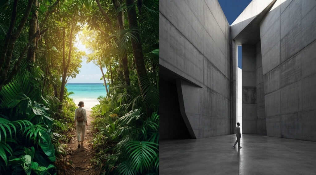
3. Nature was never the opposite of control
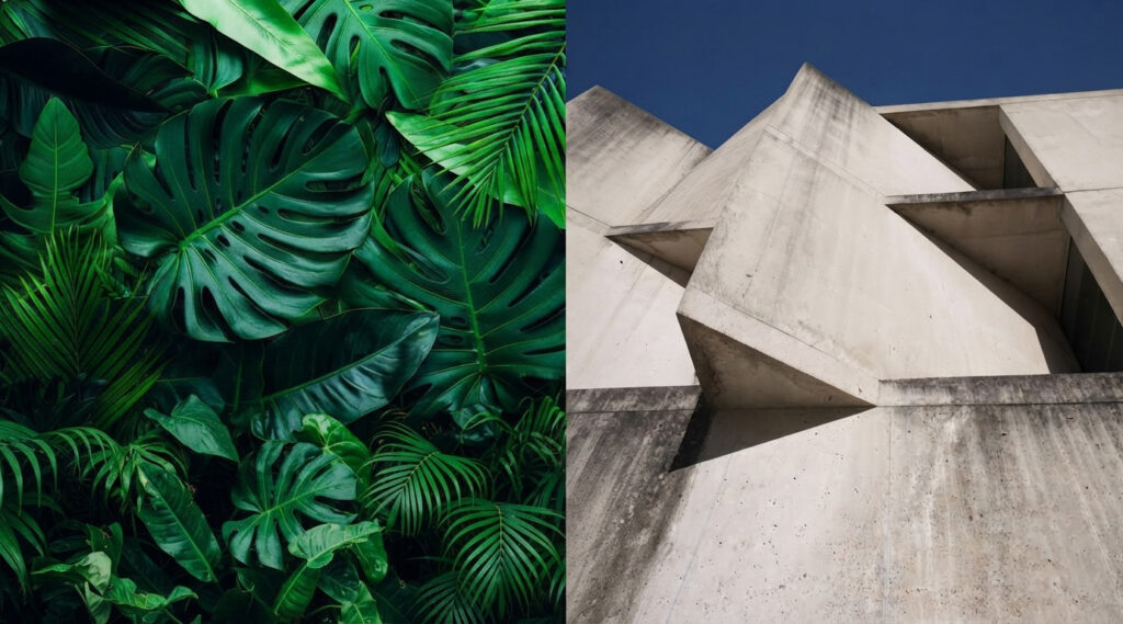
The contrast with nature feels intuitive. Leaves, skin, waves, landscapes appear unstructured, colorful, irregular — as if reality itself is more honest when it hasn’t been shaped by intention. But this comparison is only partly true, and the part that isn’t true changes the whole argument.
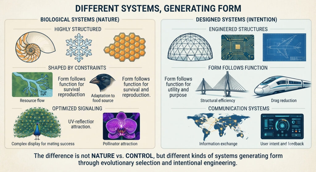
Nature is not simply free expression. It is highly structured — fractal, symmetric, shaped by constraints and selection pressures, optimized over evolutionary time for survival and signaling. A peacock’s tail is not pure spontaneity; it is a biological signal system as calculated, in its own register, as a tailored suit.
A flower’s color is not neutral self-expression; it is a communication addressed to a pollinator. So the real difference between a monochrome apartment and a rainforest is not control versus its absence. It is different kinds of systems generating form — one shaped by conscious human intention, the other by blind, iterative selection over millions of years. Both are ordered. Neither is more “natural” than the other in the sense of being less designed.
4. Why controlled aesthetics feel less alive anyway
If nature is just as ordered as a minimalist apartment, why does the apartment still feel less alive? The answer is perceptual rather than essential, and it has a real empirical basis.
Human cognition consistently associates curvature with softness and safety, and sharp angles with threat. This is not just a cultural convention — Moshe Bar and Maital Neta showed, in a series of studies, that participants reliably preferred curved objects over angular ones, and that viewing sharp-angled contours produced measurably higher amygdala activation than viewing the same objects with curved contours.
The effect held even for emotionally neutral, meaningless shapes, suggesting the bias sits somewhere close to a low-level visual reflex rather than a learned aesthetic opinion. Repetition compounds the effect: ordered, repeating structures read cognitively as system and suppression, even when nothing has actually been suppressed. So when we encounter controlled aesthetics, we often feel a reduction of life — even when no life has been reduced. Simplicity gets misread as absence.
5. Control as adaptation, and the limits of legibility
None of this means controlled aesthetics are defensive by default, which is the crucial correction to the “curated and untouchable” reading. Control is very often adaptation rather than concealment. People adopt structured aesthetics to reduce cognitive overload, to align with a professional environment, out of a genuine preference for clarity, through cultural conditioning, or simply because it’s their taste — independent of any signal it happens to send to others. In complex societies, structure is frequently functional: it enables coordination, predictability, shared understanding between strangers who will never actually meet.
Underneath this sits a deeper and more useful tension than “control versus authenticity”: expression versus legibility. Expressive systems are organic, varied, emotionally immediate, and harder to decode. Legible systems are structured, simplified, socially readable, easier to interpret at a glance. Nature tends toward the expressive pole; contemporary aesthetics often aim at the legible one. Neither is inherently more real — they answer different needs. Expression communicates richness; legibility enables coordination. Human culture oscillates constantly between the two, and most individual lives contain both registers at once, deployed in different rooms.
A. Origin of form: intention vs emergence
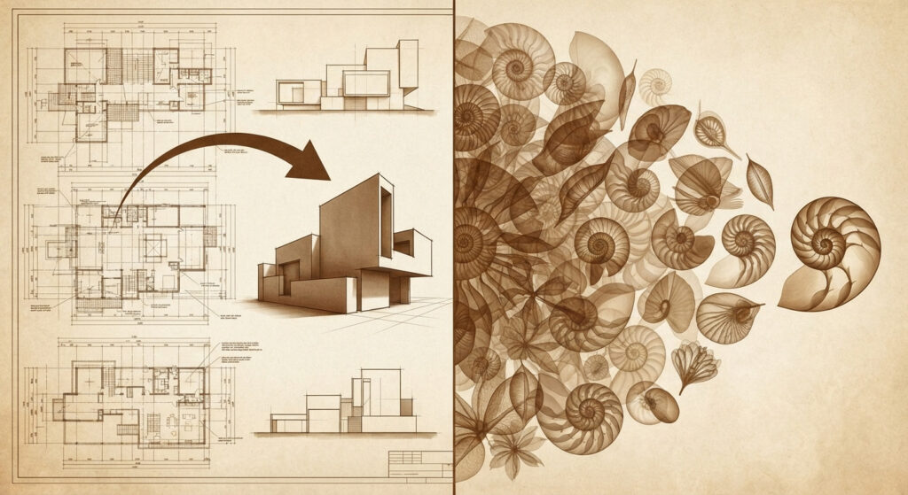
- Brutalism: form is the result of conscious design decisions. Even when it’s minimalist, every surface, proportion, and repetition is authored.
- Nature: form emerges without foresight. It is the cumulative result of constraints, mutation, selection, and local interactions over time.
So brutalism is planned coherence, while nature is accumulated coherence.
B. Purpose: function vs signaling-by-product
- Brutalism: built to solve human problems (housing, institutions, durability, cost, urban density). Aesthetic expression is often secondary or ideological.
- Nature: traits evolve because they improve survival/reproduction. What we read as “beauty” (peacock feathers, flowers) is usually secondary signaling, not design intent.
Brutalism chooses its priorities. Nature inherits them.
C. Legibility: abstraction vs redundancy
- Brutalism: tends toward abstraction and reduction. It strips variation to emphasize structure, mass, repetition, geometry.
- Nature: tends toward redundancy and variation within constraint (no two leaves are identical, but all follow a pattern).
Brutalism simplifies for clarity; nature varies for robustness.
D. Material behavior: resistance vs adaptation
- Brutalism: materials are often forced into fixed forms (concrete, steel). There is a sense of resisting material “softness” in favor of permanence.
- Nature: materials continuously adapt. Growth is responsive to environment in real time.
Brutalism stabilizes form. Nature negotiates it.
E. Time: frozen vs continuous
- Brutalism: a snapshot of a decision. It decays, but it does not “grow into itself” after completion.
- Nature: never fully finished. It is constantly updating, repairing, and evolving.
Brutalism is time paused. Nature is time expressed.
F. Emotional reading: cognitive vs instinctive
- Brutalism: often read cognitively — as seriousness, austerity, authority, sometimes alienation.
- Nature: triggers more immediate affective responses (safety, attraction, calm, alertness), often before interpretation.
Brutalism asks to be understood. Nature is felt first, interpreted second.
The deeper contrast
If you compress it:
- Brutalism = intentional compression of complexity into readable structure
- Nature = uncontrolled expansion of structure within constraints
Both are systems of order, but one optimizes for human legibility, the other for survival under constraints without needing to be legible at all.
6. When environments stop symbolizing and start acting on us
Up to this point, the environment has been treated as a system of meaning — a clue about the person who inhabits it. But there is also an independent empirical dimension: prolonged exposure to certain environments can alter the nervous system, regardless of their symbolic meaning.
Studies on rumination and mental health show that natural environments tend to reduce stress and activity linked to negative thinking, while urban environments are associated with greater stress reactivity and impaired emotional regulation. Part of this effect can be explained by cognitive overload in urban settings, which constantly demand attention, whereas nature appears to support attentional restoration.
However, this explanation is incomplete: even low-stimulation environments can have negative effects, suggesting additional evolutionary mechanisms linked to rapid emotional responses to natural cues.
Taken together, these findings show that environments are not only signs, but also active forces acting on the nervous system. An aesthetic can therefore be neutral in intention or meaning, while still having a real impact on mental states.
7. What the curated-life idea reveals about us

Outer expression and inner life are genuinely correlated: people’s clothing, spaces, and behaviors often reflect who they are or what they signal. Research such as Gosling’s work on personal environments supports this, showing that observers can infer traits like conscientiousness or openness better than chance. Interpreting personality from surroundings is therefore statistically valid.
The key error is more precise: a visible signal rarely maps to a single psychological story. A minimalist, orderly space does convey information, but only at a broad level—organization, restraint, low clutter preference, task orientation—not the underlying cause.
The same aesthetic can emerge from very different internal states: discipline, anxiety, calm, habit, efficiency, or indifference to self-presentation. Because of this, aesthetic cues are informative but underdetermined. They narrow possibilities without selecting a single explanation.
This is a classic statistical mistake: applying population-level correlations to individual cases. Like using height to predict basketball ability, these signals work on average but fail as deterministic readings of specific individuals.
The “curated life” interpretation therefore fails not because it ignores signals, but because it over-interprets them—treating partial, probabilistic information as a complete psychological profile.
The Aesthetics of Prestige
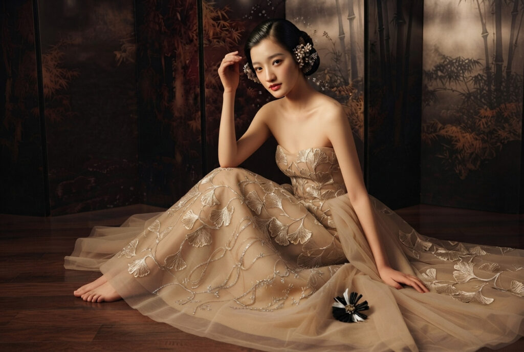
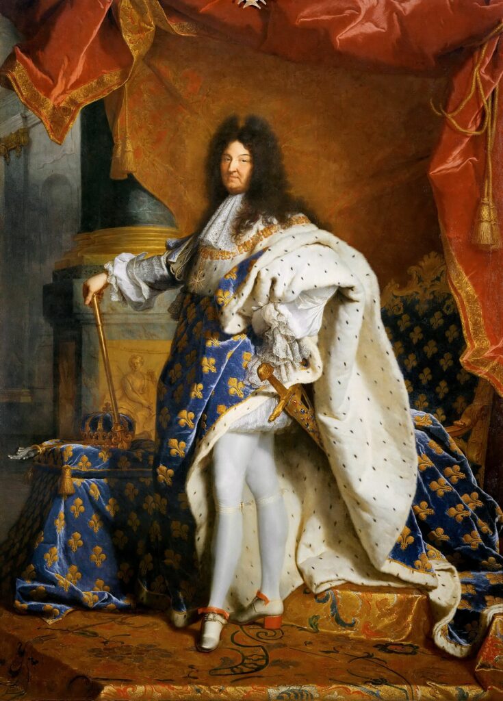
1. Luxury inherited the language of aristocracy
For centuries, only royalty and the nobility could afford expensive fabrics, custom tailoring, embroidery, rare dyes, and garments that sacrificed practicality for appearance. Portrait painters immortalized these clothes, so our mental image of “importance” became intertwined with those compositions.
Today, haute couture often recreates the same signals:
- sculptural silhouettes
- dramatic proportions
- rich textiles
- garments that prioritize presence over utility
Even without crowns or velvet capes, they evoke the same social position.
2. Fashion borrows from painting because painting defined beauty
Before photography, paintings were the highest form of visual representation. Artists spent centuries refining composition, balance, color harmony, gesture, and light.
High fashion doesn’t just make clothes—it creates images. Designers often think like painters:
- silhouette replaces composition,
- fabric replaces brushstrokes,
- texture replaces painterly depth,
- the runway replaces the canvas.
Many collections explicitly reference painters because painting remains one of the richest visual traditions.
3. Luxury is about rarity, not efficiency
Everyday clothing is optimized for movement, comfort, and cost.
Haute couture is almost the opposite. It deliberately spends time, material, and craftsmanship to produce something unnecessary.
That mirrors royal aesthetics. Kings and queens didn’t dress efficiently; they dressed to demonstrate that efficiency didn’t matter.
4. We associate permanence with importance
Paintings survive centuries.
Palaces survive centuries.
Museums preserve them.
Luxury brands constantly reference these worlds because they communicate timelessness rather than trendiness. A garment that resembles a Renaissance portrait often feels more “eternal” than one that resembles streetwear.
5. Prestige is cumulative
When people repeatedly see certain visual languages associated with wealth, influence, museums, and historical significance, those forms accumulate prestige.
Over time:
- oil paintings become “high art,”
- palaces become “heritage,”
- aristocratic dress becomes “elegance,”
- couture inherits all three.
It isn’t that luxury naturally looks like royalty; rather, our concept of luxury was shaped by centuries in which royalty defined what luxury looked like.
The deeper reason
High-end fashion is fundamentally trying to create presence. Paintings and royal portraiture solved that problem centuries ago: how do you make one person command attention before they even speak?
The answer was scale, proportion, composition, texture, controlled color, symbolism, and meticulous craftsmanship. Haute couture continues to use many of those same principles because they remain remarkably effective at making a person appear significant.
The Aesthetics of Power
The Aesthetics of Power
1. What resembles a “power aesthetic” in nature
Several systems can be observed in this regard:
- Sexual selection (peacocks, deer, birds): costly ornaments that signal health, robustness, and genetic quality.
- Social dominance (primates, wolves): posture, size, and behaviors that organize access to resources.
- Ecological signaling (bright colors, symmetry, flower size): attracting pollinators or deterring predators.
In all these cases, a common logic appears: certain traits become visible because they signal “value” within a competitive environment.
2. But this is not power in the human sense
What is fundamentally missing:
- no conscious intention to “appear powerful”
- no symbolic language
- no social construction of prestige
- no separation between “being” and “appearing”
A deer with large antlers does not “communicate status” in a cultural sense — it expresses a trait that has been selected because it functions within a system of reproduction and competition.
3. The key difference with human power aesthetics
In humans:
- power is institutionalized
- signals are culturally coded
- staging can be detached from reality (simulation, image, branding)
In nature:
- signals are directly tied to survival or reproduction
- there is no “style” separate from function
4. So is it a power aesthetic?
- Nature does not have a power aesthetic (as there is no aesthetic or political intention).
- Nature produces forms of value signaling that can structurally resemble power aesthetics.
Structural Asymmetry
1. Direct link to exploitation (in some cases)
In human societies, aesthetics of power (luxury, aristocratic codes, branding, institutional minimalism) can be directly tied to exploitation when:
- wealth is extracted from labor asymmetries (historically: aristocracy, colonial economies)
- luxury signals are built on conspicuous consumption funded by unequal distribution
- “clean”, “controlled” aesthetics are maintained through invisible labor (production chains, underpaid work, outsourcing)
- institutional aesthetics (corporate, governmental, architectural) reflect systems that manage populations and resources
In this sense, the aesthetic is not neutral — it is the visible surface of an economic structure that may include exploitation underneath it.
So here the chain is:
power → resource asymmetry → aesthetic expression
2. Indirect link (more structural and general)
Even when there is no obvious exploitation, aesthetics of power can still be indirectly connected through:
- selection processes: what survives, scales, or becomes prestigious is often what aligns with existing hierarchies
- cultural reinforcement: people imitate the visual codes associated with success and dominance
- signal amplification: aesthetics that read as “high status” get reproduced because they improve social mobility
- resource concentration: refined aesthetics often require time, space, materials — which themselves depend on unequal access to resources
So even without explicit exploitation, there is a structural bias:
hierarchy tends to produce aesthetics that reinforce hierarchy
3. But important nuance: not always exploitative
A key correction:
- not all “power aesthetics” come from exploitation
- not all minimalism or luxury implies coercion or inequality
- many are emergent coordination systems (taste, efficiency, design logic, cognitive clarity)
So the relationship is:
- sometimes causal (exploitation produces aesthetics)
- sometimes structural (power shapes what becomes visible)
- sometimes incidental (aesthetics emerge without moral content)
4. A clean synthesis
Aesthetics of power are not inherently expressions of exploitation, but they often emerge within systems where power and resources are unevenly distributed. Sometimes they directly reflect those asymmetries; other times they reproduce them indirectly through cultural selection and signaling dynamics.
OUR SPONSOR OF THE DAY : NEONNIGHT.FR
Conclusion
Conclusion
The aesthetics of order therefore do not reflect a simple opposition between nature and control, nor a naive distinction between appearance and inner truth. They emerge from the intersection of multiple systems of order—biological, perceptual, and social—each producing its own logic of form.
What we call “control,” “nature,” or “power” does not describe essences, but different ways of organizing the visible: some shaped by evolution, others by human perception, others by historical structures of hierarchy and prestige. From this perspective, an aesthetic is never purely expressive or purely arbitrary; it is always embedded in a network of constraints, signals, and functions.
Thus, the forms we associate with life, mastery, or domination are not opposed so much as they are superimposed in different ways. Brutalism, nature, and luxury are not competing languages of reality, but distinct systems for producing and reading form.
Understanding this does not dissolve the differences, but shifts the question: no longer “what is more alive?”, but “what kind of order is at work here—and what does it make visible, or invisible, in the way we see the world?”


GIPHY App Key not set. Please check settings